UI animations can be a lot of things. The best ones are lovely and elegant (yay!), but often times they just kind of miss the mark (blah.). Animations are at their best when they help reinforce your message but when the motion doesn’t fit the design, things feel off.
A Tiny Apple Faux Pas?
One example of this (one I’m always a little surprised to see is still there) is Apple’s mac product menu. The animation is exaggerated as each product bouncily scales into place and then zips off out of sight to make its equally bouncy exit. The products move in and out more like happy dancing muppets than the sleek streamlined products they really are. The animation really doesn’t match the personality of the product, or the brand for that matter. That makes it stand out for the wrong reasons.
This mis-matched motion isn’t going to stop anyone from buying their next applething, and it doesn’t render the whole design a failure. But it is a missed opportunity to use a consistent voice across all aspects of the design.
We see this all the time, it’s certainly not just our pals at Apple. Transitions that stand out because they don’t fit with the mood of the site that they’re on. As if they were designed in a vacuum and plopped into the design at the very end of the process. Not exactly a winning recipe by any stretch.
And Then, Dots
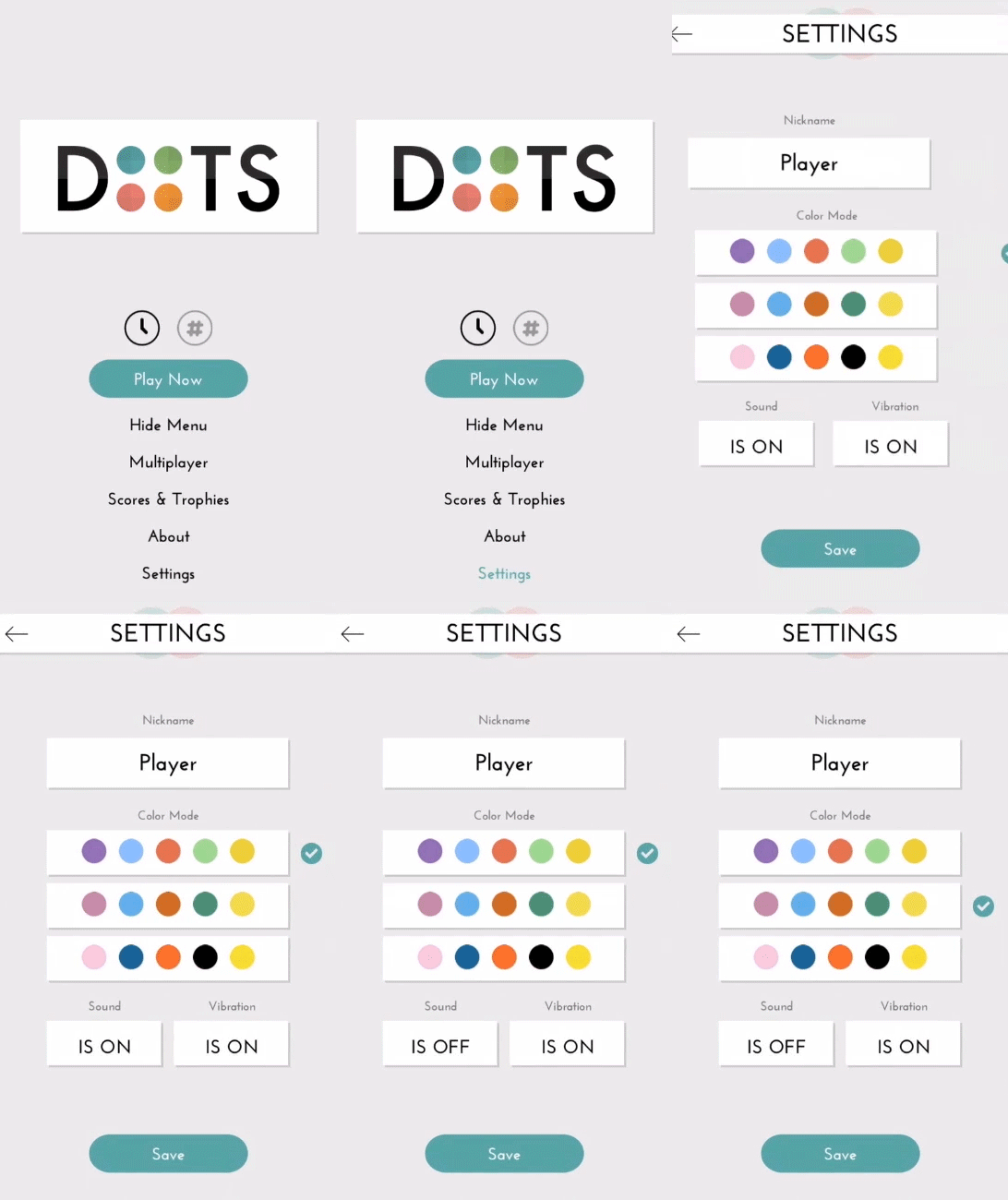
On the other hand, look at UI animation in the game Dots. The transitions applied to the menus and settings screens echo the motion found in the game.
The animation, even while you’re just editing settings, fits the mood of the app and reinforces its brand and message by using transitions that echo the ones you see during game play. Pretty clever, right? You could say that they really dotted the i’s and crossed their t’s when it came to the animation. (Pun totally intended, even if it is a rather silly one.)
You can almost picture a conductor conducting each bit of motion to ensure each fits into the bigger picture. In fact, it fits so well, you may have hardly given it a second thought until someone pointed it out.
What are your transitions saying?
A key part of designing good UI animations is remembering that adding animation is an opportunity to communicate a little something more. Any motion you add is going to communicate something; it’s really more a question of whether it’s saying what you’d like it to say.


